Citibank Reporting Application
For a clickable prototype, click here
Challenge
I was tasked with designing an application that could create and manage report templates based on the following products.
Loan
Debt
Deposits
Derivatives
Securities
Uses could then generate reports using templates for different reporting streams. Reports would have a frequency (weekly, monthly, quarterly, etc.). This was defined at the time of report template creation. Users would also have the ability to explore, consume, share and export every instance of a report.
Methodology
I started my process by laying out all the ideas I had for the application. I needed to figure out how the app’s overarching organization would work.
How many “levels” deep should the user have to go?
Where should created reports exist?
Breakdown page usage to maximize information clarity without needlessly complicating the design.
User Flow Diagram
I Broke the creation of a reporting stream out into its own process
It has an additional step and felt distinct enough from product reports
Identified the actions the user can take on existing reports
Sketch Drawing
I mapped out a few organization options for the app’s main page
Looked to existing Citibank site design for guiding my ideas
Presenting an odd number of product reports in an aesthetically pleasing way was an important question
I had to understand the differences between a product report and a reporting stream
Product reports supply their report type automatically, whereas reporting streams have many options the user must select
Chose radio buttons over a dropdown for frequency as there were relatively few choices and the pages had the space for it
Assumed that reporting streams could only have one location and line of business per report, as the requirements didn’t specific
If reporting streams allow for multiple locations and LOBs then this page would have to be reworked to not overwhelm the user with options
Wireframe
I settled on stacking the product report buttons 3 over 2. I also gave the reporting stream its own section in a similar style seen elsewhere on Citibank’s site.
Prototype
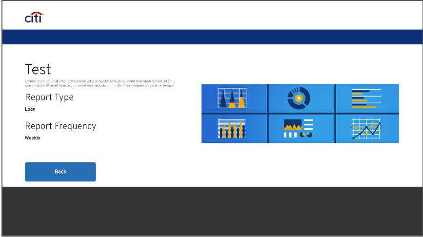
Finally I created an interactive prototype using my design. I added color, images, and linked everything in the wireframe together. To access the clickable prototype, click here.
Result
By studying the design of current Citibank websites and applications, I was able to efficiently design my application a way that fit into existing products while retaining its focus on ease of use.
Project Details:
Company: Citibank
Year(s): 2021
Team Size: 1
My Role: UX Designer
My Contributions: Design and Prototyping.
Project Goal: Create an application that could create and manage report templates.


